When Emotion Takes Over Your Color Palette
Have you ever noticed that the colors you reach for in your art often reflect how you’re feeling inside? Sometimes it’s obvious—bright reds for excitement or tension, soft blues for calm—but other times it’s subtle, almost invisible, like muted tones when you’re exhausted or feeling low. Even if you’ve never considered yourself “an artist,” your color choices can become a mirror, quietly revealing your emotional state before you even put your feelings into words.
I remember one evening, after a long day of juggling schedules, emails, and a house that felt more chaotic than ever, I sat down at my kitchen table with a blank sheet of paper and some oil pastels. I didn’t plan anything. I just started moving my hand, letting the colors come freely. I noticed myself picking deep blues and rust tones, layering them with oranges and bright whites. At first, I didn’t think much of it. But as I stepped back, I realized the combination reflected exactly how I felt—tired, tense, like things were creeping in around the edges to weigh me down., but still moment of peace and calm. It was a visual check-in I couldn’t have written in a journal without overthinking every word.
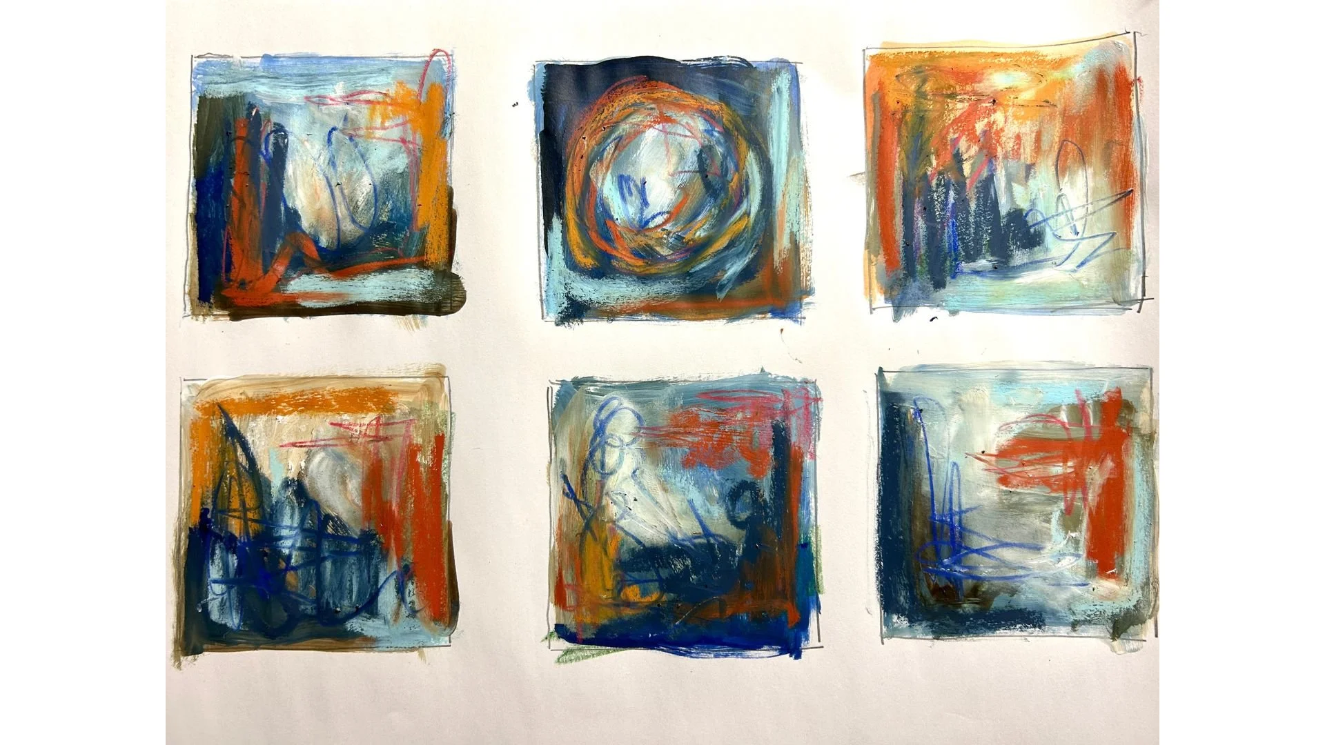
Colors and marks showing how emotion shows through intuitive art.
Why Your Palette Is More Than Pretty Colors
Color isn’t just about aesthetics. In therapeutic art, the palette you choose is like a language your subconscious speaks. Your choices reveal patterns, moods, and even conflicts. For example:
Warm, saturated colors—reds, oranges, and bright yellows—can indicate energy, intensity, or urgency.
Cool, muted shades—soft blues, grays, and lavenders—often signal calm, fatigue, or the need for reflection.
High-contrast combinations can show internal tension or competing emotions.
By paying attention to these patterns over time, you start noticing emotional shifts without having to force yourself to analyze or explain. The colors themselves tell the story.
How to Observe Without Overthinking
One of the challenges for people who feel busy, stressed, or creatively blocked is overthinking the process. You might feel pressure to “do it right” or choose colors that look good rather than colors that reflect your state. The key is to create a small, low-pressure practice where noticing matters more than creating a polished piece.
Here’s how to start:
Grab what’s on hand. Pencils, crayons, markers, pastels—anything works. You don’t need special supplies or a studio.
Give yourself five to ten minutes. Set a timer if it helps. This keeps the session short, manageable, and consistent.
Follow your instinct. Don’t plan or judge. Notice which colors you’re drawn to first. Layer, scribble, or blend freely.
Step back and reflect. Look at the colors you chose and how they interact. Ask yourself: Which color dominated? Which felt like a safe choice? Which surprised me?
These tiny observations can reveal emotional patterns that are hard to put into words. Over time, you start to see connections between your palette and your feelings.
Using Color to Process Stress
For many people, especially those who feel too busy to journal, using color can be faster and more direct than writing. You might notice tension in your hand while pressing hard with a red pastel or feel a wave of calm as soft blues spread across the page. These small cues are your body and mind communicating through visual language.
Try this simple exercise:
Pick an emotion or feeling you want to explore. It could be frustration, joy, confusion, or exhaustion.
Choose colors intuitively that resonate with that feeling. Don’t overthink it; your first instinct is usually right.
Layer marks or strokes without worrying about the end result. Observe the movement and texture.
Reflect for one minute after your session. What patterns emerged? Did certain colors repeat? Did your hand move in a particular rhythm?
This process can be done in under ten minutes, but the insights you gain are often deeper than what you’d get from forcing yourself to write a paragraph about how you feel.
How Internal Landscapes Guides You Through This
That’s why I created Internal Landscapes. The course offers structured exercises that help you tune into your emotions through color, shape, and mark-making—even if you feel creatively blocked or don’t have time for long sessions. You’ll learn how to notice patterns in your palettes, reflect on what your choices reveal, and build small, sustainable creative practices that fit into your life.
Even if you’ve never considered yourself “artistic,” the course helps you:
Use color intuitively to understand your emotions
Notice subtle patterns in your marks and textures
Create meaningful breakthroughs in short, manageable sessions
The focus isn’t on making “beautiful” art; it’s about seeing yourself more clearly and connecting with your inner world in a way that words often can’t capture.
Bringing Color Into Your Everyday Life
The beauty of therapeutic art is that it can happen anywhere. Your kitchen table, a quiet corner, or even a notebook on your desk can become a space for self-expression. Over time, paying attention to your color choices can help you:
Spot emotional shifts before they become overwhelming
Release tension and gain calm in stressful moments
Build a stronger connection with yourself, one small session at a time
Even five minutes of intuitive coloring each day can create a ripple effect, helping you approach your life with more awareness, calm, and clarity. If you’d like to learn forecheck out my Internal Landscapes course.
