
The Colors I Live By: My favorite colors as an Artist
Growing up, my favorite color was yellow. I loved how bright and cheerful it was. It was the color of my favorite things—sunny days, sunflowers, even my room.
Somewhere in school, though, I got tired of answering the question “What’s your favorite color?” The girls always said pink or purple for some predictable reason, and the boys always said red because it was strong or blue because it was deep.
My snarky side kicked in, and I started saying my favorite color was grey, mostly to be different. When asked why, I would explain that white is all color and black is no color, so grey is the infinite possibility of the in-between. That became my answer for decades.
But the truth is, I don’t have a single favorite color. I just love color. My love for color is too expansive for just one choice. It shifts with my mood, the season, and the light in the room. Certain hues catch my eye one day, others on another. Color speaks to me, moves me, and appears in my work in ways I don’t always consciously plan.
And while I don’t like some colors or palettes don’t really appeal to me, like pastels, I don’t hate any colors either.
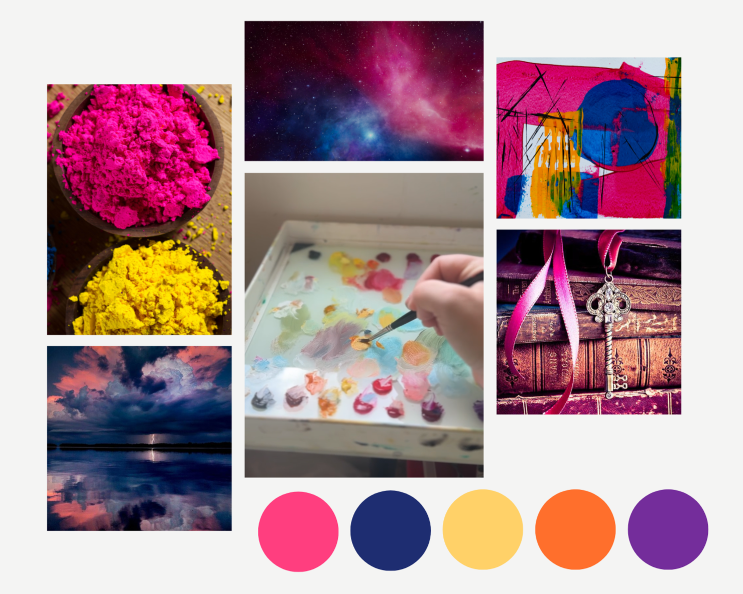
But certain colors do show up again and again in my life and my art. They have become part of my identity as an artist and even part of my brand. These aren’t colors I force onto a piece. They are intuitive, chosen by instinct, emotion, and spirit. I reach for them over and over, and they appear recognizably in my work.
Indian yellow is my go-to for anything I want to glow or illuminate. It gives many of my paintings their sense of inner light, especially in my prophetic pieces, and is layered heavily in base layers to create that feeling of being lit from within.
Prussian blue is rich, deep, and juicy. It’s often my choice for shadows, for glazed areas, or for the expansive, spacey skies that appear in my visionary work.
Alizarin crimson adds depth and warmth, blending with Indian yellow to create gorgeous pinks and reds in flowers, giving the work that lush, vibrant quality I gravitate toward.
These colors tell the story of my creative energy. They are bold, rich, and unmistakably me. They reflect how I see the world—alive, layered, and unapologetically present. My palette is not static. It shifts, it evolves, it surprises me. But certain colors are my constants, and they have quietly shaped the signature look of my work.
I don’t have a single favorite color, and that is the beauty of it. I have many, and they speak louder than words ever could.
